Feburary UX will do you some good

I was a proud participant in the first meeting of a event called UXXU – or UX for good. It took place over two days here in Chicago at the lovely new Adler School of Psychology. They recruited a rather large group of expediters, experience pros, SME’s or business owners, and ‘sparks’ or accomplished designers that offered each group something ‘out of the box’ ideas. Still, it seemed like an intimate affair, something each person felt some ownership and pride of being a part of, unlike a convention.
My team numbered around 10, and certainly the first few hours of the project were spent in learning about each other, and going over the brief together. Our problem: What could we identify as an opportunity and solve in a day and a half? Our client: Global Lives who takes film shot from volunteers around the world. Their intro video is a great primer to understanding how many people live on our earth, what income distribution looks like, and how we have a hard time empathizing or even understand people across the street, no less across the world. Yet people have little interest, how to change apathy to empathy?
The team initially balked at this as an online experience, citing people’s short attention span, as well as the ubiquitous nature of video as barriers to even parsing the content. Competition from entertainment, foreign films and other global media forms further confused the experience. And the unedited nature and single focus made the content suitable for art exxhibit, but what was the story that compelled someone to spend 24 hours with someone? It was clear that the constraints of incentivizing the growth of the library was a priority, as well as providing some hook for interactivity that could focus the raw footage into something digestible. Even if we got that far, moving someone from apathy to empathy seemed like a long shot.
An interview with the founder of Global lives (David Evan Harris) filled in details on the way the project came about, who potential users were, and how they benefitted from taking the time to participate. Our group extrapolated that the filmers of the biography really had the most life-altering experieince. Could we have students, filmmakers, or lay people relive the filmer’s experience? Perhaps in an immersive environment like a museum, but online seemed problematic.
No matter how hard we tried, the group had difficulty framing a problem statement that could give us something to sink our teeth into brainstorming solutions. The audience seemed more or less unmotivated to interact, our potential filmmakers seemed to be too outside of a normal user group. Labeling the audience as students and teachers appeared to solve the problem of motivation, but left many of us – me included – feeling a bit unsatisfied. Even students and teachers are overworked and apathetic about seeking new ways to learn. One idea from our guest “spark” – the poet – gave some insight. The way YouTube is sparking global changes in dance, by sharing non-verbal or kinetic information, has speeded up the communication channels between very disparate cultures using movement as a common language.
Watching more of the existing video, it became clear that it was very verbal. Subtitling brought one a further step away from the engagement, since there was no particular story to tell. Condensing the content was too tricky to tackle. Not to mention that Bruce Mao’s advice was to come up with something big, not to worry about budget and scale. Or in a sense, "Make no small plans, for they do not move people to change". At this point, I began to wonder if 10 participants was just too many, we seemed to have so many times where we reached dead ends. Not to mention we had a very focused client available to us, but we felt like we needed to get beyond a wireframe into something insightful, something that could move people to change, in other words a HumanKind act.
HumanKind is a framework I work with at Leo Burnett. It is a grade or a scale, 1-10, with 1 = destructive. Graduating step by step to a 5 = I understand the brand’s purpose. Then elevating up to 7-8 = Changes the way people think and feel. This works quite well for print and TV, but digital has a bit of a twist. A viewer has to work through an experience to make it to those higher numbers. TV and print can sometimes go straight to 8, bypassing the earlier hurdles. With that in mind I offered the team the following framework, which I have been brainstorming on for the past month in relation to another project:
- Notice
- Find
- Interact
- Read
- Understand
- Share
- Register
- Return
- Trust
- Rely
The goal of this is not to aim directly at the higher numbers, but to see how you strategize methods to ease a person through each step.
1 Notice. I think of banner ads, or anything blinking that attracts attention,
2 FInd A tiny bit higer up, but similar to notice. Something may be on your mind. We can imagine the people, what’s on their minds? Are they using Google, or signage, or social? Our client could also find partnerships with education and artistic sites such as learncentral.org and adobemuseum.comand a featured Google doodle.
2 Interact, they click on something, while this all takes place quickly, its a big step, someone is interested, and wants more.
4 Read – Literally to parse. You find something you are looking for, you see a picture, but there’s context, from the previous steps that need to be respected. You got here for some reason, we can reward you to read and keep engaged.
5 Understand. – Understanding is seeing the component pieces (recipe) and understanding the goal of the whole piece (epicurious). Getting here is pretty imporant, how can we move on?
6 Share – Sharing is valuing, the ease of sharing has fueled the social web. Sharing has been made simpler to accomplish, but still means that someone values your content.
7 Register – The person wants to set up a relationship. The person has understood has understood your value position enough to give up anonymity. It took e-commerce a long while to overcome this step, but it means profit.
8 Return. Welcome back! A return visit is a relationship, make sure they see new things, are able to be greeted as a valued participant.
9 Trust. Through the process you have built a relationsihp, is it something where the person really thinks of you as an authority, or is the relationship all physical? You give them what they want. Trusted relationships can also be fickle, if another service provides a better value.
10 Rely – The pinnacle of online experience, It can happen quite quickly or take a long time. Its all up to the creators to make something that if it was gone, people would be pissed.
In closure, this construct helped us come up with some tactics to work with our insight that standing in the shoes of the filmaker was the most powerful place to engender empathy. The tactics worked our way through 5, which for most experiences is the best you can hope for. Moving up the ladder is a journey that is great to brainstorm about, use this or some variation on your next project and let me know if it helps.
January Thoughts on touch computing

One year or thereabouts past the introduction of the iPad, it seems safe that the term ‘touch computing’ has a sound footing in devices that are readily available in both the large, small, and medium sized flavor (Samsung galaxy). Contrast this to ‘normal’ computers and other sorts of remote controls which I supposed can be be called ‘button computing’ (which leaves out ‘dial’ computing I suppose). There’s no doubt it opens opporrtunities to design new kinds of interaction.
So what did the iPad do that is truly new? I’m getting a fair amount of clues from some apps (Popplet, Flipboard, Color Splash, Twitter, Keynote) but it is clear that it is different than how you would use the smaller device, but not clear what the ‘sweet spot’ is for users yet. Just like the VR gloves we’ve seen for ages, It is truly a new input device, people can directly interact with information in a way that feels very different. And size does matter,. the extra space makes ‘meta’ gestures like swipe and some 3 fingered actions easier. The key to understanding the future is how to create information on these devices. Will it be to play a virtual violin on stage? Likely not.
The iPad has plenty of attraction but questionable affordance, a term Donald Norman appropriated to describe the intersection of a product and how someone percieves its use. For example: In a recent fit of carpentry, I had the desire to cut a shape out of wood. At the hardware store I was tempted to solve the problem with a new ‘all-in -one tool’ that could both cut shapes as well as a myriad of other tasks (as seen on TV). Alternately, there was a jigsaw, the ‘traditional’ tool for the task. I purchased the all-in-one tool, found it to be too hard to use, and ended up with the jigsaw.
Problematically for users, what kind of task you want to complete is a tough call. Computing in general never really purports to afford the user any particular kind of solution. Even though “People don’t want a quarter inch drill, they want a quarter inch hole” says Theodore Levitt. The machine’s flexibility is really the value proposition. Outside of the rather large realm of what is possible through an internet browser, we certainly can isolate word processing, data processing, and message processing tasks (email) as being well suited to a traditional computer setup (screen and keyboard). Less traditional uses such as gaming and most online activities are about selection, pointing and clicking, and take place in that oddly separate peripheral, the mouse.
Other computer tasks such as video and image editing may even have created a new peripheral, the drawing tablet, or the dedicated keyboard with more prominent buttons to emphasize the activities common to these tasks. While many people find copy/paste keyboard shortcuts easy to remember, I think its fair to characterize that dedicated buttons are a variant on a control interface of a computer and in a sense a ‘hack’, but an useful one for educated users. They do not usually announce themselves, so this can be considered a barrier to entry. In general custom buttons are sort of a dirty solution to user control, regard the general hatred of remote controls as evidence.
And speaking of dedicated buttons, we can include smart-phones in the discussion of computing. I’ll admit a real feeling of frustration/stupidity when trying to ‘unlock’ a cellphone and not being able to locate the ‘function’ key it was so adamantly asking me to push. I had to call the phone company (on my iPhone) to find out what one that was (its in the lower left corner, oddly not mentioned in the owners manual). Which brings us to the newer world of capacitance screens and being able to merge a bit of the button pressing interface with an actual tactile interaction. Bringing it closer to how we make selections on a website, by poking at it.
As innovations go, there are certainly people that value a physical keyboard, how ever divorced it is from the full size version, for the minimum reason of being able to transfer their skill in typing to another realm. Personally, I’m waiting this year for voice activation, and computers understanding contextual multitasking through voice we saw demoed back in the 90’s So, the iPhone and capacitive screens offered a slight variation on the mouse and keyboard, replacing them with virtual counterparts, Steve Jobs legendary button phobia is well earned, outside of a QUERTY keyboard, each variation in button function encourages variation among programs and general lack of learnability. The iPhone with virtual buttons and a sparser screen helps mitigate the problem, and is teaching programmers to be thoughtful in button use and placement.
Manipulating info on a small screen like the iPhone was intended to translate well to the large screen of the iPad. As of this writing i think it’s more of a case that as Diddy once said, "mo’ screen mo’ problems."he bigger screen does allow for webpages to be displayed in a way that doesn’t require an alternate design as is popular on the iphone. I noticed right away that clicking to navigate is not quite ‘fun’ on the iPad, and that if you are used to doing lots of selections, the iPad doesn’t handle linear navigation as effortlessly as a computer screen. We are perhaps too used to multiple screens, multiple tabs and multiple open windows and the forced focus of an iPad seems like a step backward.
However there are some experiences that are quite surprising, the processing power and large screen make virtual musical instruments quite enjoyable like the aformentioned virtual violin, Korg vintage synthesizers with virtual patch cords and dials work great. Most single window interfaces are quite enjoyable on the iPad. But the innovation just arising from efforts like flipboard and twitter is what I’ll call a ‘sliding’ interface. When you select something in a list, the chosen item then ‘slides’in a new pane containing the information. This slightly covers the list, and can be slid out of the way or further slid around to highlight details. By avoiding a linear path, these interfaces start to show where innovation in how we read or consume on this new device. Unlike ‘picture in picture’, the real innovation is to keep context much like top or side navigation, but to overlay a new contextual layer.
And who said consumption is all that great? iPad is certainly a natural in consumption. Books, magazine and video are all delightful, and certainly the main use people will have for the device. Out of the box, there is just something sci-fi about laying a screen on your table or lap and watching a movie. The legacy of televisions being heavy cathode ray tube containing boxes has not been entirely erased from memory. Even the relative position of a laptop screen doesn’t have the same wow factor as the iPad.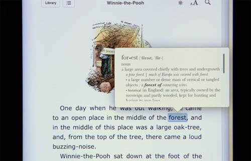 Also the stamina of the battery and the somehow missing feature of the Kindle being able to read in the dark next to a sleeping partner, is an easy win. I also use and appreciate the computer aspect of the book reader, looking up references inline in dictionary or Wikipedia is also very futuristic and useful.
I’m a bit fearful that iPad 2 will incorporate a camera. As a photo viewer, the iPad is great, a perfect companion (with the sold-separately camera connector) on a trip. But as a large viewfinder to a tiny camera, I think it’s a step in the wrong direction. It would, if rear-facing, perhaps revive the interest in augmented reality, now only being slightly resuscitated by the translator program Word Lens. So in conclusion, people will want to touch their information, layers are the way forward, and consumption is good, but to really shine, its figuring out a way to create will create change.