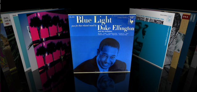
In 2006, a developer named Jonathan del Strother created an application called “Cover Flow”. This was an amazing achievement for several reasons that are still something I think define what makes the difference between a good and great user experience. Using your phone or itunes, compare the version Jon made (in the movie) to the final version delivered by Apple, and you’ll see a world of difference. I also think it inspired me in a few ways I wish to share
Know your tools
He used the newly minted tools that apple had made available to developers, namely core animation which had just come out. These were used to great effect. The lesson – leverage what is given to you and use it in a unique way, rather than try to invent everything yourself.
Don’t start from scratch
In this case, the app just takes information such as album name and artwork from Itunes and presents it in a novel way. Clicking on a record simply creates a playlist in itunes. Lesson – Know your limits, and use information people trust or are familiar with to get them hooked on your service. Still, let the user update and fix that data as easy as possible, when your service doesn’t get it right.
Details are the product
Note the subtle animations on hover, on glide, on click. The way the elements move from back to front and fade in on launch. The twisting of the point of view when the mouse cursor moves from left to right.These elements give that feel of engagement in a visceral way, and breaks down the wall between you and your album covers. This information was so long missing after CD’s and digital took over, it made it fun to just flip through your collection again.
A slight change in point of view is enough
In this case, literally, the change in perspective from 1 point perspective to top-down is enough to make a world of difference. Remember Khan’s downfall, not being able to think 3 dimensionally? That often can bring a new idea just thinking how to not make information appear flat.
Emphasize the interaction
Notice how search is hidden away? While it works great, and can be useful, the most important thing is to touch and scroll and interact with the album art. Don’t always emphasize what may be the most expedient way of giving people what they want, but make browsing and exploring pleasurable. I always note that the success of games like Angry Birds isn’t that they aren’t just fun to win, but fun to lose. Make browsing and exploring your main focus, and people will choose you over more direct gratification.
.
