How do you turn an idea into something you can build? First step, don’t start thinking about the technology or design.
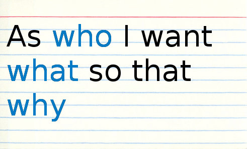
Your two essential starting idea ingredients are a value proposition, a service, told as a story like ‘wouldn’t it be great if a person could do x and achieve y’. Then picture a person who would fit or desire that scenario. For now we can call them a persona. Someone who would seem to embody a desire to suit the goal.
So to address the User Experience as a team if we have these ingredients we can start imagining scenarios how they will do the ‘x’. At this point we tend to try to make the idea “better” or call out what will and won’t work from an implementation point of view. The business goal is to differentiate their proposition, the production goal is to minimize risk and cost of delivery. The experience design is firmly in the middle, trying to figure out what can be minimally delivered that achieves the goal for our currently hypothetical user.
The tug of war is how much or little is needed to get the user to their desired state. Our goal is to reduce scope. If scope seems already small, our goal modest, then we can begin to introduce possible errors or even new personas to see if it all holds together. Now debate amongst the team, does the process to get somewhere seem to fit within your persona’s abilities and timeline? Do they get better at it and we have to model for new and repeat visits? How do they find it?
Some other considerations to test your user process against and hopefully address or avoid:
Do they have to learn something new?
Do they have to change their existing habits?
How do they understand or perceive the value?
Do you have to present valuable information from an unreliable or “noisy” source?
How do you handle unreliability of dynamic data?
Are the steps clear?
How do they know when they are done?
How do they know when they made a mistake?
When designing physical items, you can work off of some templates, the size of hands, relationship of what we manufacture to human attributes. Famously, Frank Lloyd Wright houses were considered unlivable by people who were taller than his somewhat compact 5’8” frame. It’s the cardinal rule of Human Computer Interaction to not confuse yourself with the user.
- Dan Willis @uxcrank
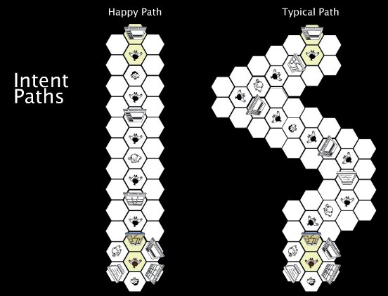
This imaginary user or persona follows what we can call ” happy path”, we look at existing resources and patterns to see how many steps you need to achieve the value. While this ‘happy path’ doesn’t really reflect all the work, it does give us an idea of scope. How many decisions, interactions are needed to get to a reasonable finishing point. We should be honest now about technical issues, is the experience able to be offered? Is it reliant on personal information, or value-added data that has to be optimized? Do they connect value using data from friends in social networks? What happens without a critical mass of users? Is security or privacy an issue? We want to address how much effort the target user will have to expend to be satisfied, and match that effort to technical considerations and remove if necessary any obstacles. Even though the steps may be many, we want our path to keep the user engaged in the story.
Pick up the tooth brush
Wet the brush
Take the cap off the tube
Put paste on the brush
Brush the outside of the bottom row of teeth
Brush the outside of the top row of teeth
Brush the biting surface of the top row of teeth
Brush the biting surface of the bottom row of teeth
Try to make yourself understood while answering the question of someone outside the door
Brush the inside surface of the bottom row of teeth
Brush the inside surface of the top row of teeth
Spit
Rinse the brush
Replace the brush in the holder
Grasp cup
Fill cup with water
Rinse teeth with water
Spit
Replace cup in holder
Wipe mouth on sleeve
Screw cap back on tube
Place tube back in room mate’s toiletry/shave kit so s/he doesn’t realize that you forgot to bring toothpaste on the trip
If you involve your user persona in the initial planning, you see how much of what you can deliver technically and in design that could be removed by determining the user didn’t really care or notice? This reminds me of the “seeing every penny of the budget on the screen” concept, what isn’t on the screen is considered waste and the User Experience design should make the most of that investment.
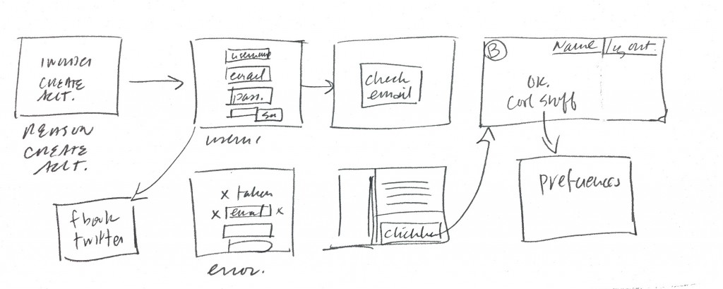
Normally the design or wireframe dictates how we start talking about users, by starting with stories and diagrams, by engaging non-designers, clients, and others in refining the path, your design will then have a more focused goal and the design’s job is to keep the user engaged and oriented throughout the process to reach the goal. If you can feel confident in the former you can, you can move forward to start sketching, which we’ll cover in step 2.

