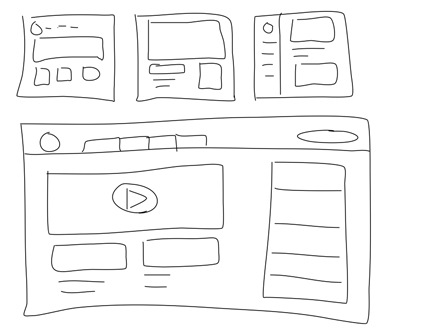
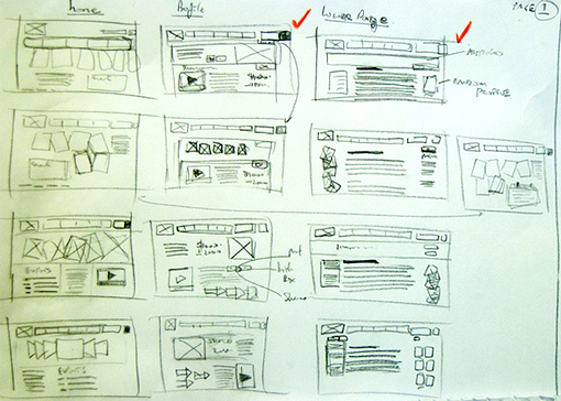
The next step after you’ve refined your value proposition and created personas is to map out the user journey. This is hard work, but it pales in comparison to realization. In fact, it’s often tempting to get right into building because planning an experience is like planning a city. Stakeholders, clients, team members, bystanders will all have an opinion on what features and approach will be needed. You are starting with a blank slate, so get out some reams of paper and start sketching, it’s the easiest way to try and focus on what is needed at minimum, introducing the concept of minimum viable product. This also helps the team focus on not hiding complex functions in simple language.
The problem with sketching is also the best part of it, you’re really unable to get into fine details about images, color, long text passages. Also, since it is a computer interface you don’t have to be particularly good at ‘art’ (if you can draw a square, you’re ok). What you can concentrate on is how much does someone need to go through to satisfy their goals, and how they learn to achieve them. We can then test their approach in a series of sketches that simulate their actions – choosing, manipulating, and navigating. All of these goals can be managed on pieces of paper and a willing participant with your team simulating the ‘computer’.

Paper prototypes can also easily incorporate some of the learnings from mobile UX and interfaces. The bloating of websites with more and more content made paper prototyping hard to cram in all the information. This bloat disregarded the very short and value-oriented attention span of users. Sites and clients are now refactoring to remove the plethora of options their desktop sites had to fill space. Mobile offered a new lease on being able to focus on the important items which are also easy enough to test with the limits of paper. For the cost of a chocolate bar or coffee card you can get quick feedback on how much you will need to design to reasonably match your goals with real user feedback.
One more plus is that you can also design it as you are testing it. The expectations with paper are low, design a few new pages or try a different way on the fly. The experiment here is to see if you can communicate on the page, and doing this with the team or with willing co-workers is a first step in gaining confidence in your approach.
Watch a paper prototype test example
I find this mockup to be a bit high-fidelity for my taste, but the person and process is well documented and the learning is spot-on. There is also a limit to cost and time needed to get to some kind of consensus. Knowing what points in the design you need to concentrate on will be crucial as you progress further into the build. I have practiced Scrum and Agile for many years with many insightful ways to help match requirements to deliverables, but I think the reliance on words to indicate activity and value may just be impossible. A quick visualization, a few calls-to-action and a button or two helps focus everyone on what the user will experience -a complete lack of interest or knowledge of all the hard work behind the scenes, only the realization of it.

You may continue to enhance the fidelity by turning sketches into what are called ‘wireframes’. This may be a good step if you are really concerned about visual hierarchy and how to fit dynamic or important textual content within different screens. The only problem is that they are not very good for feedback and normally need to be explained or heavily annotated. If tested, they tend to be more static and mocking up different approaches on the fly is impossible. My next step will suggest taking sketches straight to prototypes.
A good final document of your exploration is a flowchart of how you think the user progressed best, along with notes on ‘gotchas’ that may need some design patterns to solve, or any sense of dissonance you got from what people clicked on. A few common things I have experienced:
People like to click on large items, especially pictures. Often these are used as decoration in the design. Think about making them clickable and think of what they can accomplish
Document and try to justify what your testers manipulate in your sketch and use that to optimize language or sizing in further prototypes.
Minimize deep navigation, it’s tough to prototype and confusing to the user. If the site is complex, try giving them a task such as ‘customize a 2013 Acura TXL’ to be sure you have that area sketched out.
Language is hard to sketch though, some pre lettered labels or a fine pen helps to change things in mid-test. An array of paper pieces and sizes can help for changes in wording and popups.
Animation is also pretty easy to do with paper (ala Terry Gilliam) – use your paper as a canvas to slide things in and out.
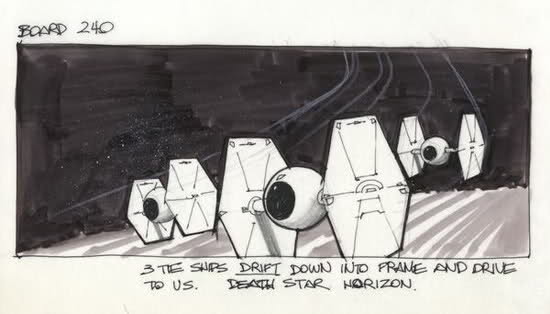
If you do animate, use the Hollywood storyboard technique and indicate motion on your sketch or notes.

