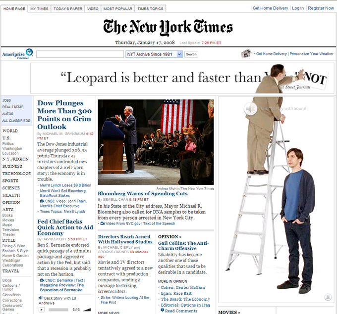
If you’ve been following the progress of the web over time, it seemed as though there were two distinct user experiences. One set of sites seemed to be based in markup and text. They were practical and hard working. Sometimes they were built with standards which meant the code, script and design were in separate places to make them easy to update and take advantage of dynamic data. Sometimes it had “design”, it was epitomized in sites like Google and Amazon. There was another web, this was the web of Macromedia/Adobe Flash. These sites were “designed”. They promoted sexy things like brands and entertainment. They tended to take place in one window, but contained features like animation, gaming, motion and other trappings of rich media. In fact rich media banner ads were one of its main uses.

Rich media ads, most are not this entertaining.
In part because of the discovery of Ajax (javascript being used to update a page rather than going to a new one), partly the inability of Google to actually find things in flash-based content, but mainly because of Apple and their firm stand against Flash within mobile browsing, the prominence of Flash is begining to wane. Much of the new innovations in HTML5+Javascript+CSS3 also make of the abilities of Flash native to the browser so not as crucial for highly designed experiences.
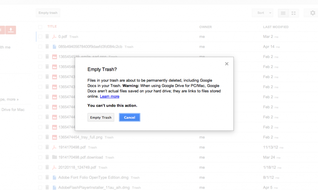
My interface hero came far before this turn, in 2006, but pointed the way that the HTML web could be as cool as the Flash based sites. He solved a particular thorny problem in experience design, while inventing a thoroughly modern way to handle a particularly odious convention known as the ‘modal dialog’. The modal dialog steps in when you need further information from the user to act upon their choice. This can take the form of a dialog box which contains a confirmation or other choice. It has a rule that it must be decided before proceeding. It has the heritage of the desktop convention of a ‘print’ dialog. Often you are locked out of the underlying program before you make the decision it asks you for. It makes you stop and think, and we know that is always something interfaces should try to avoid.
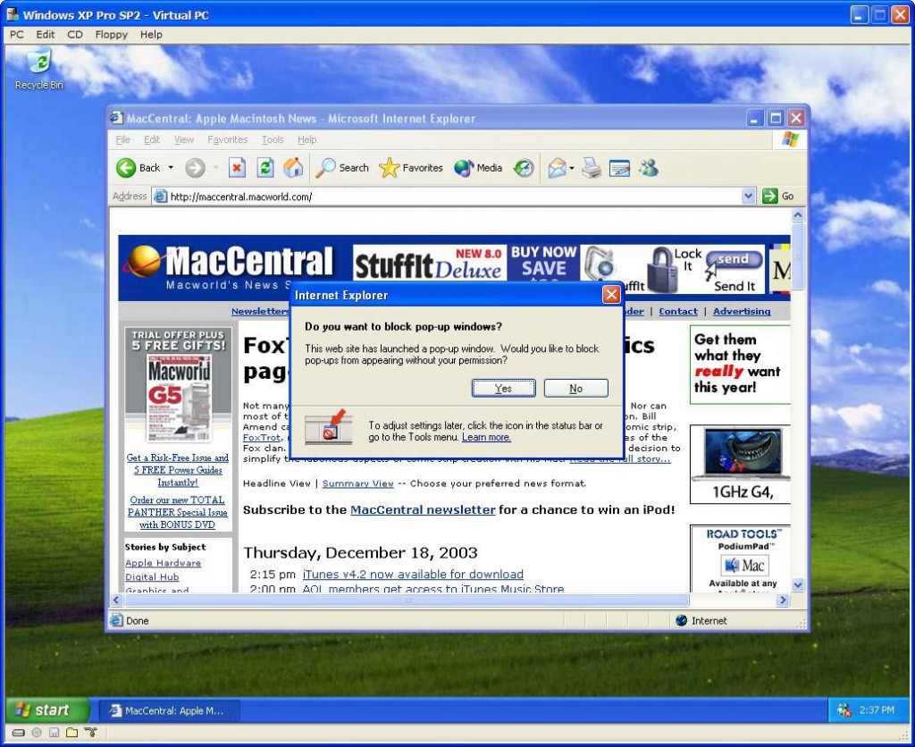
On the web, it took the form of one of the nastiest little javascript feature – the alert, or pop-up window. This was so popular among the unscrupulous coder that it became a browser feature to ‘block’ these windows when the code asks for them. This technique was so reviled, but still so useful it continues to this day.

Let’s block those popups!
How then could you handle these sometimes necessary choice or modal interruptions while still allowing the user to go back to what they were doing, and not resort to the ‘back’ button (or the ‘undo’ of the web as I like to think of it). Enter Lokesh Dhakar (@lokeshdhakar) who saw an opportunity to enhance a common problem – enlarging a thumbnail image.
Designers attempt to fit as much as possible on the screen. When browsing, pictures offer color, variety, and personality to a page that would otherwise be overly textual. However, these thumbnails are small and tough to see. What if you want them bigger? Do you click, go to a ‘detail page’ (see flickr.com) or could you stay where you were and just enlarge them without leaving the page?
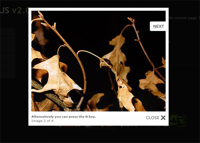
In December of 2006 the script Lokesh wrote took any link to an image from a smaller image and rendered it inside the current window. To make it even sexier, he added a dimmed background (with either a transparent image or if the browser could handle it, transparency) and then used a technique to ‘grow’ the image from a seed to the full size. Add a close box, or the ability to click off the image and dismiss it, and you have an interaction that spread like wildfire. It was unobtrusive, meaning if it didn’t work for whatever reason, the user would still see the image in another window. Therefore it was painless to add to any HTML site, and it became quick to add to many sites. He had the good fortune to name it ‘lightbox’ which was easy to find on search engines, and the script was easy to see by viewing source code too.

Lightboxes are everywhere
It was taken by others and improved over time. Adding the ability to paginate through slideshows, add real HTML to recreate those pesky dialog boxes, and other great tricks make it a pattern that is the standard for when you wish to focus the users attention. Variations include the tooltip and the popover. While a small thing, patterns in user experience design are precious, and those that work to create them for all of us to benefit from should be recognized. Cheers!
