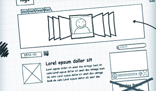
I love the idea of prototypes. They seem to embody an experiment, a risk, or an idea that could be great or could be lousy. They are, like sketches, the physical manifestation of an idea into the ‘real’ world. They allow you to stop being a creator and view something from another perspective or show them to another person. Prototypes show and demonstrate rather than describe and imply. The problem is that they are often considered difficult or time consuming and are an ‘addition’ to design rather than a key step. I think this is quickly changing and this post is to describe a journey I and some colleagues took on evaluating a bunch of tools and seeing which is one that is worth it. This article is circa April 2014, so beware this landscape changes quickly.
Quick review: design of a user experience starts with refining your goals and stories. This helps focus the team at the real problems – engaging users. Secondly, sketch and test, use pencil and paper to get quick and cheap feedback on how people come to understand your proposition. Sketching also helps gather the team around goals. Often we hide complexity in simple statements, “they upload a picture of themselves” is something I hear in many meetings. Sketch out how do they really do it. What are the steps? How can we refine this to mitigate frustration? Is it absolutely essential to achieving the user goals?

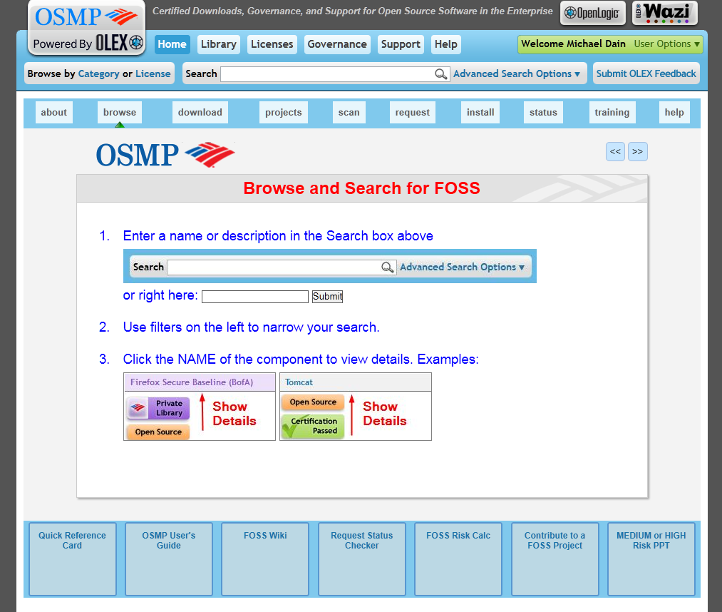
No prototypes were created or actual visitor was consulted on the design of this terrible process – page – design.
Once thought through and sketched, we proceed to mimic the conventions users will employ to get at the value. In most cases, people rarely stop to scrutinize the page, instead they look for quick clues that outline the main actions, and they act instinctively until they reach a dead-end or find something that satisfies their goal. This has slight variations within dynamic content driven or commerce sites, where visitors may be more goal-oriented. In this case the prototype a single goal.
Many designers think their sites are works of great literature while the reality is much closer to a “billboard going by at 60 mph. – Steve Krug 2006
This is where an interactive wireframe works wonders. Unlike any static design, our prototype mimics actually moving through the experience. This used to only be possible using HTML, which still offers some advantages, but did not allow the sort of code-free environment we get from a prototyping tool. For mobile and desktop development there are several good choices. Pioneers like iRise, Axure, Balasmiq, and Caretta are challenged daily with more web-based tools like Proto.io, HotGloo, Mockingbird, Notism, Codiqa, and InVision. While the choice of tool isn’t crucial, let me outline some of the features you can look for.
- Take existing design comps and ‘wire them up’ to be interactive (InVision)
- Create web viewable portals where sites can be experienced, and capture comments and suggestions from clients and stakeholders. (Most of them)
- Offer libraries of common UX patterns that can be referenced (Axure, HotGloo, Mockingbird)
- Offer libraries of common UX patterns that actually function (Codiqa)
Some things that may help you decide which is the best tool:
- Have you already ‘designed’ the site and want interactive feedback? (InVision, Notism)
- Are you looking for advanced effects and transitions (still lacking in most tools)
- Is a page metaphor ok? (Balasmiq)
- Or do you use ‘layers’ so that states are turned on and off to simulate action (Axure, Proto.io)
Some tools start with the idea that the site has been designed, often within Photoshop or Fireworks. In this instance, you upload these images and create hotspots that indicate user actions. This has affordance with many teams, where “design” comes into play quite quickly. The disadvantage of prototyping designs is that the experience feedback will be mixed with the aesthetic and language feedback. It can muddy the waters. Feedback at this point in the process should be dramatic and wrenching. The only way to move forward could be to trash this whole approach and start again. By investing in visual design and copy, there is less chance that you will do that. I have gone through months of fruitless review with flat wireframes and designs when one quick prototype could have quickly revealed our user issues, so I have learned that design shouldn’t be introduced at this point, but it certainly can be used later.
If you take your sketching experience to these higher-fidelity tools, you should begin to make decisions on major points of language and controls. What does the basic layout look like? I will suggest that this first prototype does not contain any other activity than the ‘happy path’ – the route users will get to their goals in the most expedient way. This assures that the ‘storyboard’ aspect remains the goal. Is it satisfying and are the choices realistic and well thought through? This concept is known as ‘paving the cowpaths’. Making sure where people should go is well-lit and safe. If your team and stakeholdersn are satisfied you can move forward, or if not, keep working through it until you think it seems satisfactory. Then you are ready for step 4 in the next post.

Paving the “snow” paths?
