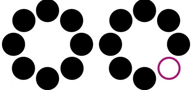
 Our next fundamental gestalt principle I want to introduce is similarity. The ability to discern what elements are like each other, which are dissimilar, and also to match an elements purpose to something we expect or have learned. Much of this understanding comes from the ceaseless amount of experimentation we do as babies and young children. From understanding what shape a handle should be to pushed or pulled, or what peg fits in round (or square) holes, we love to be able to recognize an object and fit it to it’s purpose. If you have ever laid stone, or appreciated the end results, you can see how it is not a trivial skill to be able to find the right shape out of chaos that and form a whole that all fits together. Let’s understand that ability and use it to make better designs.
To start reading is a learned form of pattern matching. We learn the shapes of letters, make those into groups of sounds. Over time and practice, we can become proficient in interpreting these shapes into words. This allows us to read quickly, and one reason that most books are set in fonts over thousands of years old, because we recognize those shapes. It’s also the reason USING ALL CAPS is harder to read, it removes some of the ‘bumpiness’ that makes letters clump together to form a word. Yuo can see htis prinicple in example where lettres are intentionally mixed up. As long as the general shape and length are the same, you still understand the meaning. However, if you insert an unex$ected element, we cannot understand it because it doesn’t fit our expectation.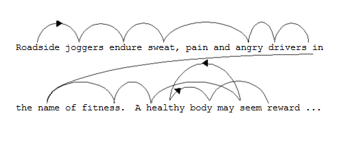
 One of these things is not like the other
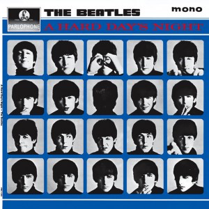
Another core of this principle stems from our early ability to recognize faces, or more crucially our mothers face. While these four guys are similar in many respects, the famous cover of Meet the Beatles is a good case for how even though they look quite similarly mop-topped, small features distinguish them from each other so we see four distinct people. The similarity of most of the objects also helps us discern the back of George’s head as an outlier. Perception of similarity comes in handy to be able to pick out the ‘rotten apple’ from the pile of edible ones. It is also used in design to help us focus on a major element out of a group. See what I did there – bolding or italicisising one word is extremely effective in drawing attention. As long as you don’t use it too much. There is often default bolding of text in HTML headers for example. Turn it off, you’ll get much better results by using it sparingly.
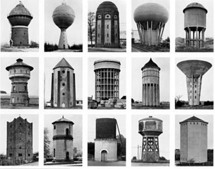
Artists are fond of creating bodies of work around similar compositions. Exploring slight variations allows their work to take on more grandeur and profundity, much as a symphony builds emotion by repeating and building upon a motif. People innately enjoy recognition and pattern, and reject dissonance and asymmetry. Often the reason successful artists are stuck in a rut, their audience appreciates recognizing their work as ‘more of the same’.
The work of photographers Bernd and Hilla Becher is inspired by the design and recognition of similarities among industrial buildings. Through painstaking documentation, they were able to elevate commonplace structures to what they termed anonymous sculptures even though their designers didn’t intend them to be noticed for their aesthetics. In their topology series they documented in a very neutral way the structures that were built for a particular purpose. Displaying them together let the viewer perceive the similarities, and draw information from the similarities. In this example: Water towers. They documented dozens of different building types with the same cool lens for decades, and elevated photography as art in the practice.
What does it all mean?
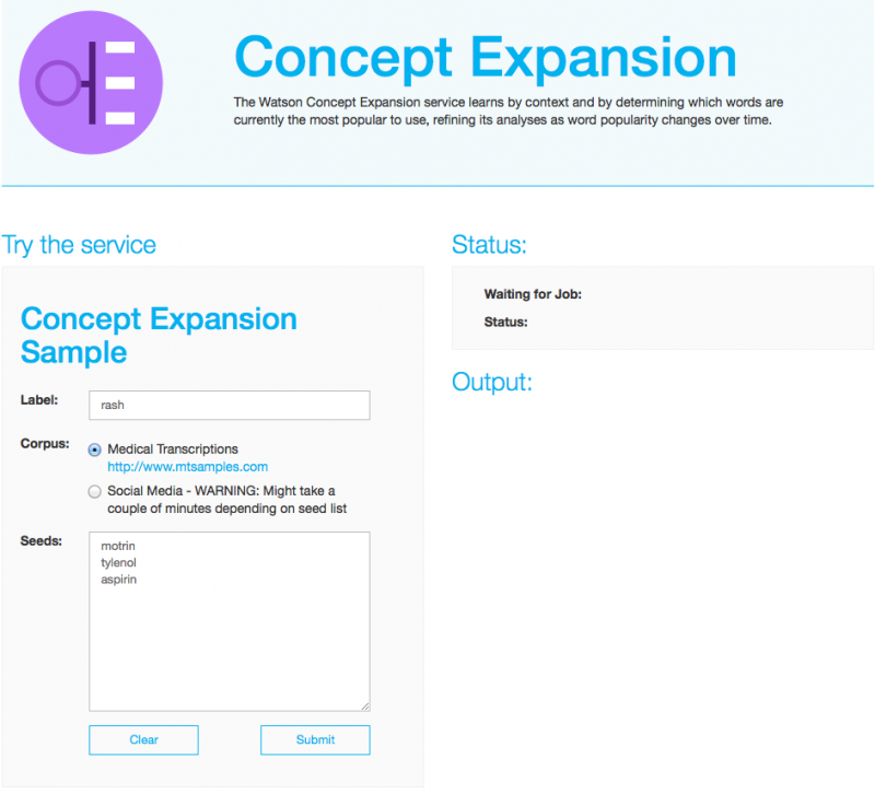 So how does similarity help interaction designers? Through practice, users try to quickly parse and understand and recognize elements they could interact with that fit their goals. Take this example from IBM. The page is a series of grey filled boxes. Repeated except for the area called “Output”. This makes you recognize that something is missing since it doesn’t look like the others, but has the same format. On one side there are white boxes with words in them. Experience has taught us that these are ‘form fields’ and our job is to fill them out. Experience would have us surmise that submitting it will make information show in the output area.
However, the blue color used for headers is also used for a hyperlink color, and for the outline of the ‘submit’ buttons. Also the emphasis and weights of fonts seem to go out of order – “Try the service” is smaller than the sub-heading “Concept Expansion…” while the simplicity of the form may allow the user to recognize what is required after a moment, items looking similar yet conveying different purposes is what we’re trying to avoid in our design. Lack of consistency will always cause a bit of confusion, or distrust of the intentions of the experience. Often users give up without really knowing what they are doing wrong because they are in fact reading the design correctly and intuitively, but the design doesn’t reward them for their skill.
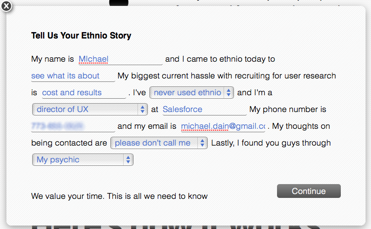
The history of internet design is filled bad examples. To be fair, It did have to invent a new design paradigm – interactivity. But much of it was built upon static print design, its non-interactive foundation. Over many years, some patterns have emerged. Constant redesign allows us to destroy the past, but room for improvement is always present. This example uses very non-conventional patterns to achieve a better result. There are no ‘boxes’ to fill out. It follows a more narrative format taken from the everyday task of completing a questionnaire on paper. So while not following the standards set in HTML, it comes across as more friendly. While the previous example used the form field pattern, it goes to show that some of the recognition value is not always appropriate to engage users.
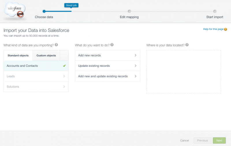
A hybrid example of the same form pattern, a sequential set of actions, with each showing a clear hierarchy, but also emphasizing the main points and not using such terse language. The color sticks out in help, progress and an encouragement pop out. The minimal coloration helps us recognize the overall pattern instinctively. Where the function of the text differs, as in the ‘objects’ tab or toggle, the text is also different to reinforce its differentness. Text, alignment and other elements shown here are also aided by the theory of proximity. The rule is to make sure that elements that show themselves as different from the others convey why that difference is important to the experience. As animation becomes more a part of this kind of static design, the idea that an element can draw attention to itself, then fade into being part of the regular hierarchy is also effective.
Making connections
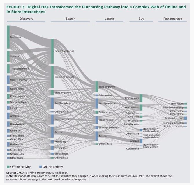
Non-interactive designs also benefit from understanding this rule. In this case, the data is fascinating, but the design is confusing. The header for some reason is in green, and the initial color of the pathways is green. Therefore the subject of the header digital should logically be connected to the color green, but in fact it’s the opposite. You have to refer to the legend and then really look closely to realize it’s indicating the opposite. In this case, blue is also used to underline the column headers, which further confuses the issue. Color is one of the reasons early explorations into design tend to leave it out. In this example, the point is muddled by the color, and while the story is fascinating, the design makes it hard to understand.
Clickability
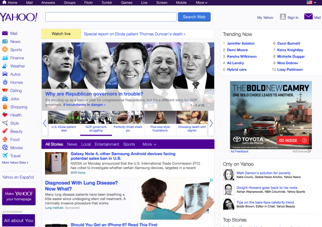
Desktop-oriented websites are only recently tending to simplify their similarity hierarchy. The user visits the page and decides where to take action. Having a consistent action color differentiates it from regular text. By default, hyperlinks are blue and underlined. Because underlining text is harder to read, because of our clumping rule above they are usually removed. Still, blue is a key learned color to show clickable items. In Yahoo’s favor, they stick to a variation of this color, with quite a few variations in size, and a confusing push toward purple as a ‘branded’ color. The overall design is probably clear, the only issue being how many choices there are. In this case, because of the similarity, you’re able to see an overwhelming set of choices, which in itself makes finding the right one more difficult.
Operating system design – for better and worse
Similarity is when you perceive a relationship based on some attribute of that element, being shape, color, size. Alignment can reinforce and actually allow dissimilar items to be perceived as similar. As interaction designers, the important aspect is to allow the design to reinforce easy parsing and understanding the actions that come from selection or manipulation. A useful, but flawed metaphor from the beginning of computing, the desktop. As you can see, addition of iconography and design helped differentiate one element from another. As these became more commonplace, it had the opposite effect, items became more difficult to discern their purpose, their alignment or misalignment didn’t help to parse a really complex choice, which to interact with. Desktops became dumping ground. It took advances in mobile to try and change this paradigm, since it was so ingrained in user expecations.

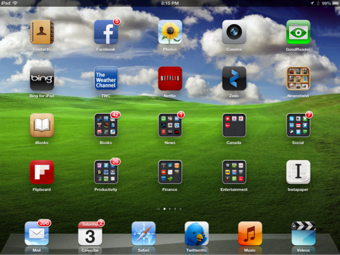
In the phone/tablet area the first innovation was the springboard launcher or as what I like to call the box of chocolates pattern. Moving from desktop it really takes full advantage of how we perceive similarity and parse through similar items – apps. Document and content was left for within the app to manipulate. Only the addition of the ‘alert’ icon takes great advantage of perception of difference. This makes such alerts that much more effective. The icons all being identical sizes and later adding the ‘folder’ and ‘newsstand’ areas creates a feeling of too much similarity, managing large amounts of apps is still frustrating for users. Fortunately they can edit the positioning, which can help group things in useful ways. I feel there is a lot of room for improvement to this type of experience.
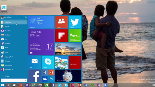
And whether or not it was considered improvement, the tile design of Windows 8 did offer another way to differentiate content and launching applications within a variable structure. The innovation of different type/size of tiles lets you recognize and prioritize the display to what you feel is important. The difficulty users had is does this add or detract value from the goal of launching an application? The design of choosing either icon or dynamic text seemed random, and not necessarily reflective of priority or need of attention.
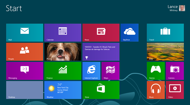
It’s interesting to see how this design changed and been refined in Windows 10. Certainly gestalt similarity is not the only reason these elements are presented in this fashion, but they are a main source of why and what makes for a successful interface design. The main point is that users expect to be rewarded for recognition, they seek it out, and if the design choices are consistent, and reward the feeling of putting a round peg into it’s corresponding slot, it makes for happy customers. When it doesn’t seem to fit, work with your clients to get them to understand the psychology of what they perceive. Sometimes they can be convinced, often they are right and you have to go back to the drawing board.
