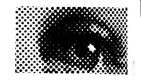
Welcome to Gestalt 2, proximity. These Bauhaus theories of perception have helped designers understand how to use innate human visual abilities to maximize their messaging for centuries. They can help you make more effective interface designs. They also help educate “I’m not a designer” clients or customers on why some design works or fails, and how to fix it. The crux of the theory is to quantify and describe innate visual abilities of all humans. Visual perception has evolved over millions of years, we are a very visual species compared to other animals that have sophisticated smell or hearing. Humans find it very easy to identify patterns and discern slight differences. Gestalt attempts to show how this ability can be understood and manipulated. We covered figure-ground in the last installment, this next theory really covers how we perceive items in relationship to each other, it’s the theory of proximity.
When items are spread far enough apart, and without any thought to similarity of size or any other relationship, they are perceived as separate items. As shapes are repeated, and are aligned, we perceive them as being part of a whole. In interface design we often align items that we wish to equate their relationship and meaning to be similar. Often this is done creatively, sometimes for convenience, but more often than not without much actual thought to how a viewer is supposed to use this relationship to aid them in their goal.
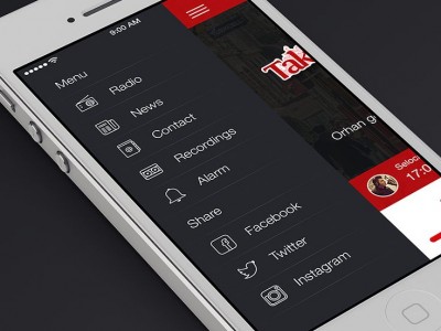

A couple of bad examples, the insidious mobile hamburger ‘menu’ on left, where you can pretty much put anything you want. For this reason, even though there is proximity and alignment, there is little other connective understanding of why these items are there. In this example, these seem comically disconnected. Far more common in the example at the right, some items are centered, some are larger, some are bolder, some have colors. There is a fair amount of connections, but because of misalignment, misshapen, and other differences, the user has to work fairly hard to discern what the overall message may be when it could be stated more simply and clearly without the excessive stylistic differences between elements.
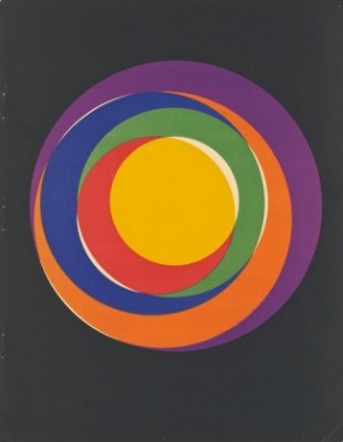
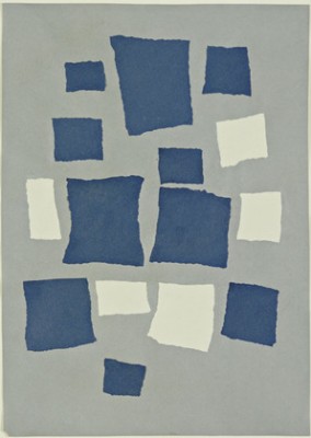
To start, proximity is pretty straightforward, especially once a figure/ground has been established such as a screen or piece of paper. In fact, it’s harder to create randomness or unrelatedness. Here Max Bill and Jean Arp try to play a bit of a game with disconnectedness. Most famous, Arp’s piece on the right titled ‘random dropped paper’ – it’s been debated that this couldn’t truly be random, it proves that by simply being on the same 2d plane we cannot help but to perceive and connect items together to make relationships.
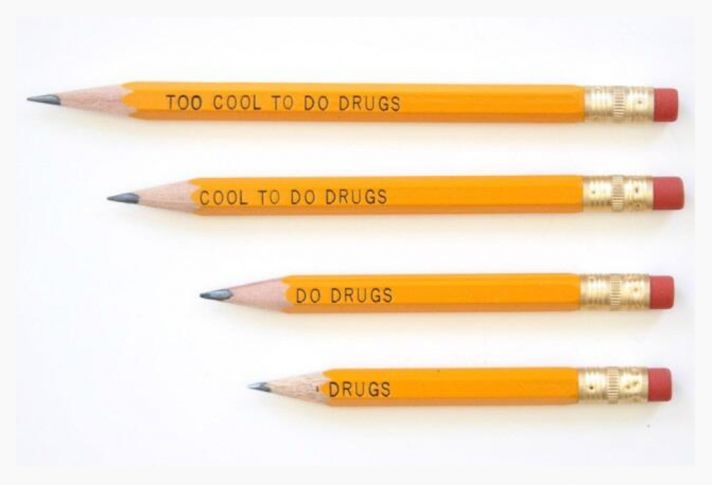
So the first helpful aspect of proximity for interface design is that your viewers will have no problem seeing relationships between items, even if unintended. The notable skill is to make this relationship purposeful and meaningful to the overall goals the items are attempting to describe. You may not want to reinforce such relationships so that some dissonance or different treatment is needed. Proximity and alignment are powerful tools, they are even able to covey narrative, as shown below.
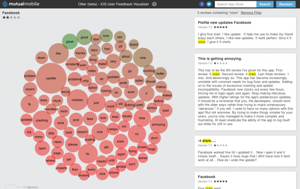
Where can this go wrong? As shown earlier in interface design, we often align things that have no real relationship. We can also over-rely on text and geometry to reinforce our story. We can also over-emphasize visual elements like boxes and borders to reinforce a relationship between items that if left on their own would provide more data without them. The ‘flat’ interface movement of the past few years was to remove these tropes of visual connection in favor of the most minimal representation of items. Because proximity and alignment do most of the heavy lifting in showing relationship of items, its a welcome trend. As you can see below, the visual metaphor is understandable, but the interpretation is tricky. Is proximity to the center, or the use of a cluster telling the story of what these words mean and what action I should take due to this knowledge?
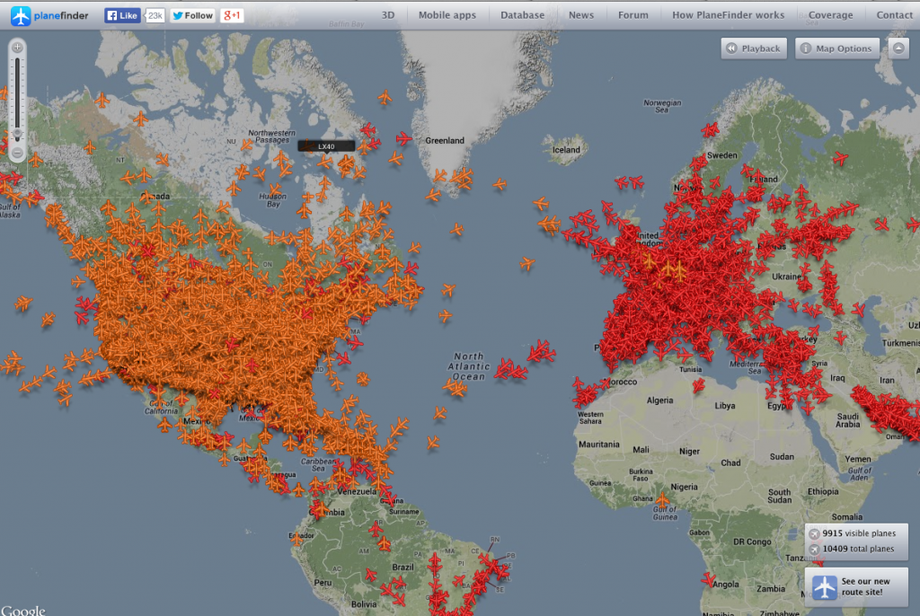
Another example, and while this should be completely random, the data helps us understand that most planes are earthbound. In this case the actionable data shows that air traffic from abroad is much lower in volume than domestic traffic. I don’t know the value or the action I would take on understanding this fact, so because the difference in color is the main takeaway, we hope that it is something crucial to the experience.
Our final lesson in proximity and alignment come from lack of both, this was very prevalent in the early days of the web, the HTML language only contained primitive methods to actually align and distribute elements across a page, so that often misalignment and lack of proximity were more common. While forgivable, whenever things are not aligned to a very exacting standard, most viewers can discern even tiny degree of dissimilarity which they can perceive as being ‘broken’ or ‘confusing’. Its often just described as ‘ugly’, but as with music that has lots of dissonant notes, you can use dissimilarity to draw attention, but too much of it can just come across as chaos.
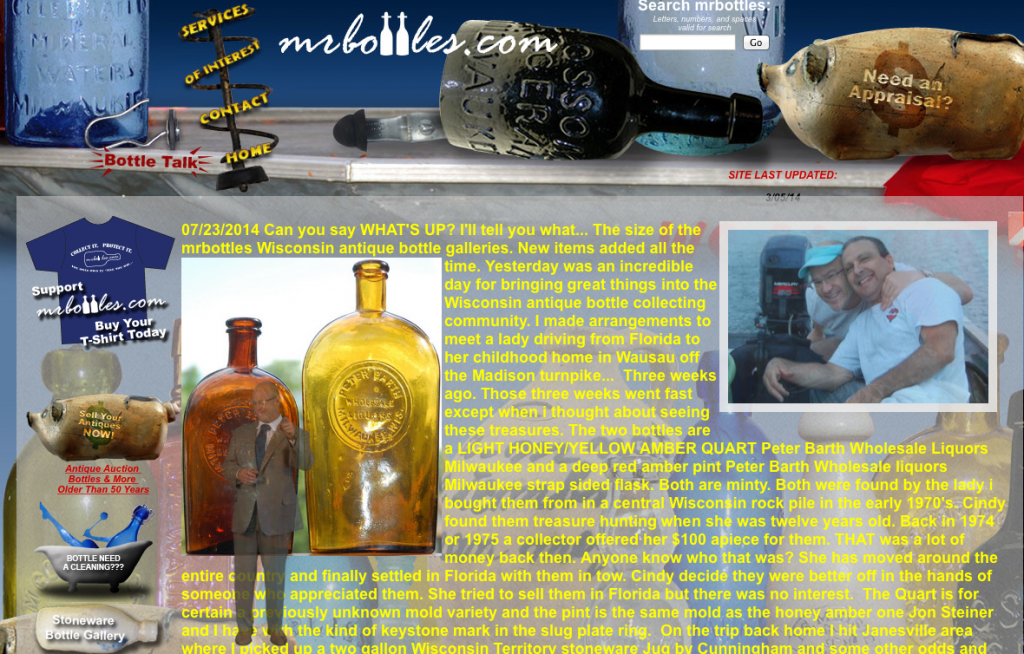
Sorry to pick on Mr Bottles, this may be so dissonant that it is actually pretty remarkable. Normally a lack of proximity and alignment is subtle, in this case it is almost gleeful. Each related element is misaligned, so parsing and understanding the offering takes quite a while. To add to the fun, there is a an animated talking narrator that seems to stand somewhere on top of, or amongst the content. In any case it is a tour-de-force of dismissing the Gestalt principle of proximity and alignment, so experiment and share any other examples of proximity right or wrong in the discussion.
Pingback: Gestalt Theory – Anndelize: Visual Artist