To be nostalgic about old computer interfaces really only seems to take place in the world of videogames. Its rare that people reminisce about Windows 3.1, although OS 9 has a couple of fans. I heard a heartfelt review of a videogame on the Totally Rad Show where one of the latest and greatest games was unfavorably compared to Super Mario Brothers. This was brought home even further for me this Fourth of July weekend while I used an emulator for my Iphone called “Frotz” to replay (after 30 years) Zork II. I must say it was still quite fun. Most of all because the interface (words, typing commands) were just about the most sophisticated user interface there was back in the late 70’s, and continued to fit the interaction perfectly. It was much the same with the Super Mario comparison, more buttons and more joysticks doesn’t make the experience of playing any better, or different, that’s why Mario can beat Conduit, it was just more fun to play.
Graphic interfaces are much the same, with the early GEM interfaces, the Macintosh, Lisa, Windows, its easy to see why some way of accomplishing system level tasks like copying and organizing files with the aid of a mouse grants computer savvyness to a whole new group of people. I recall helping a programming professor install fonts on his machine. As a ‘command-line’ kind of guy, it was an utter chore to type the names of all these obtuse files to run the “copy” command. It really made you appreciate drag and drop. However, as the first job of UI designers, coming up with compelling metaphors and conceptual containers to mask the system commands was an enormous and mostly successful challenge. Familiarity with these basic metaphors by almost every strata of user has made computing ubiquitous. Pointing and clicking is certainly understood and can be accomplished by small children. Its all good.
But is the dark side complacency on some bad conventions that stifle further innovations? These conventions can be ingrained in how we think the computer works, and hard to remove. The computer is entirely malleable, and conventions and consistency are normally very desirable things. Google offered people an alternate to find information, flattened and listed by popularity. But the Spezify search engine offers another, visual, non-hierarchical on a plane that stretches past the visible window. Both are valid, but web innovations are slow to reach the OS. Crap ideas may be with us forever much like the functional, yet reviled Internet Explorer 6, simply because they are baked in, and they ‘work’ to most users satisfaction. Still, it doesn’t hurt to complain. Here’s my vote for top 6 crap computing UI metaphors, and hope that one day we can get beyond their well meaning, but ultimate too successful integration into the users mindframe.
6. The “Help” menu
Much like any well meaning idea, the need to actually use words to explain the function of your program, along with illustrations or some kind of hand-holding, is one that most people appreciate, but rarely ever use. “The manual” was always a bit of a joke in computing, because we can just try to use it and ‘figure it out’. I am in the habit with my kids that when they ask me how to accomplish a particular computer task, I always reply “Look it up in the help menu”. But that is considered identical to ‘I don’t know’ and they move on. But the truth is that we don’t know. Most intuitive use of a computer interface only accomplishes about 10% of its actual features. I recall reading an entire book on the ‘curves’ dialog in Photoshop, which is only one of a multitude of functions that somehow everyone has access to, but few have used without determined explanation. Perhaps the failing is one of language, describing what we want to do and having the help dialog fail to educate? I recall the ‘office help’ pane that attempted to show ‘inline’ how to solve a particular problem. Other help programs open in a new window, but they always seem to interrupt the flow of actually working in the program itself, perhaps that’s why they are so little used. The only problem is that a hidden bunch of advice is continually hidden away someplace, perhaps “clippy” wasn’t all that bad an idea after all, but it forever scared designers away from trying to help – “help”.
5. Menus in general
At the top of computer screens were a list of words, those words when hovered over created another list of things that could do things of interest or need. Then even those words could have further menus and thus the world of nested hierarchical menus was forever ingrained in the user experience. The basic topics came with the first menu system usually called ‘file’ where you kept your save and open tasks. Sometimes choosing tasks opens dialogs, sometimes not. The next group called the ‘edit’ menu which could contain just about anything, but cut, paste was in there. After that, as many as could fit. Normally they gave up at about 8, since literally fitting them all in the available space was a chore for smaller monitors. Also, wording of the main menus was terse, to fit more topics, and of course, the inconsistent use of language made it practically unlearnable from program to program. Since it doesn’t take up much room, and the implementation is painless for most programmers, the menu system is here to stay. Fortunately, as I write this, I realize I have never even looked in the menu system for the program I’m using. Not to get me started on button bars, but contextually, the graying out of menu commands and the whole use of a hierarchical system to display non-hierarchical data (as in, one item is not necessarily more important than the other) seals the deal with this UI stalwart.
4. Word processors – well, mainly Word .doc’s
Text sort of ‘came’ with computers, as my example above of playing text games illustrates, well that’s what that keyboard was for I suppose. But how did the keyboard actually do something in a GUI? Even now, in the operating system, or web, typing does practically nothing without a program or context to ‘capture’ it in, or more relevantly, print it when you were done. It was called a ‘word processor’. In some world, this could be a program like VI, which pretty much lets you type, then do actions on the words within if need be, but it’s a ‘mode’ you are in, typing in order to see the words and do something with them. When WYSIWIG programs came out, it was quite the rage, you then were able to preview how your words would look when printed. The killer app begat Microsoft Word, Word Perfect, and perhaps some others. None of this is especially bad from a UI perspective, only that most people’s needs in writing is to communicate to others. Posting thoughts on a website, sending an email, commenting on a blog, these are uses of text that rarely needs special commands, formatting, or the half a billion features common in Microsoft Word. It usually satisfies itself as a box you can type in, but this box doesn’t exist within the computer interface. It is ingrained that we must use a ‘word processing’ program to write words. However, if it is never to be printed, or even if it does (Microsoft publisher), Word is definitely not the easiest or most efficient program to use. Considering I’m writing this in my email program, you can see that just a blank text area and the ability to save drafts is all you really need to write. The main reason this bugs me is I always get .doc attachment in an email I just find it redundant. To say nothing of .docx – how many dollars does Microsoft need so I can type?
3. The browser
The web was a place ‘out there’ where interesting pictures, words and things you could click on were found. However, not to mention the complexities of ‘connecting’ to this internet place, the other thing you needed to enter the gates was a ‘browser’. It was not so clear what this browser was good for, other than let you click on things. You could bookmark favorite places. You could kind of see where you ‘were’. If you were Microsoft, browsers didn’t allow searching, you could enter what is called a “URL” if you could type backslashes. All in all, it was a pretty weird thing. Nowadays, its even worse because you have 4+ ‘brands’ of browsers, and within that, versions. While most of that doesn’t matter from a user’s perspective, the capabilities of browsers, and the philosophy behind them is pretty relevant if you want to make websites. But since web files are just files, interpretable from a variety of perspectives, its a shame there will always be this ‘middleman’ in the way to interpret and display it all, almost as bad as the file system.
2. Folders
Considering the web is just a bunch of files, with funny names, and links to other files, such as images, movies, etc. Its interesting that that metaphor is still pervasive in our personal space of the computer, our hard drive. To be fair, it is tough to imagine how best to convey the ‘physicality’ of the information you store without the metaphor of a file ‘icon’ or a program ‘running’ or a folder ‘containing’. It makes perfect sense. Although, as we have all discovered, we are poor filers. Even when I was a filer, there was a homogenous quality to the information, a library like system that made the filing usable. At least in some sense if you needed the information badly, you could possibly find it. Computers long ago demolished the actual system by which we could hope to determine what files were things we should pay attention to, and what was magic computer stuff. I think Windows was far worse with all the .bat files and junk that if you wandered into it you wouldn’t have a clue what it was or why it was there. Amongst our own stuff, there were MP3’s, gif’s, jpg’s .docs, .txt, .sav. oh, well the best thing we could do is put it in a ‘folder’ and hopefully that context would clear things up. All in all, the folder kept us under the illusion of control, and really was just a rug to hide lots of messy stuff about computers that we would rather not deal with. However, it’s here to stay, since any attempt at a more task or goal grouping of files like ‘spotlight’ is even more mentally challenging, keywording is certainly powerful, but not ready for the masses, perhaps because there is nothing to hide behind.
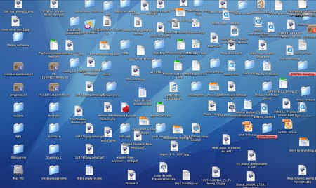
1. The “desktop”
I had a friend who was having trouble with his hard drive, so he dragged all the files out of it, and onto his desktop (it was a mac). Then he reformatted the hard drive. While this was disastrous, it illustrates what an odd place this desktop is. Almost every ‘normal’ person I know has a desktop filled with files. Even with the joy of desktop pictures, people keep the lovely view covered with a rigid grid of things that are ‘important’ or need attending to. Much like our physical ‘desktop’. However, with our real desks, everything isn’t neatly arranged, or conveyed by a small icon. These things have context, meaning, size. Things that give them some further sort order in our minds. Computer desktops are sterile places, only out of sheer force of will can things be taken from it and put somewhere else (swept under the rug of some folder named ‘important’ perhaps?). The odd thing about this place is that it is part of our filing system, yet displayed prominently, it’s the first thing we see when the computer starts up. And that kind of prominence is tough to replace with anything else, even lovely vistas, or family smiles are just a background to all these little items we have to contend with. And it gets worse when you have folders there… well, you get the idea.
Any good news?
Mobile phone operating systems. The iPhone/Pre for example doesn’t use any of these conventions. Perhaps new devices may be able to wean people off of bad UI conventions, and in turn can help developers innovate. Oh, perhaps Google OS will do it too? Although I do despair about the ‘browser’, it will probably be with us for a while, even if it’s called chrome. *** Late breaking update, apparently the Google OS will be written in HTML!. So score one for the ‘elimination’ of the browser!