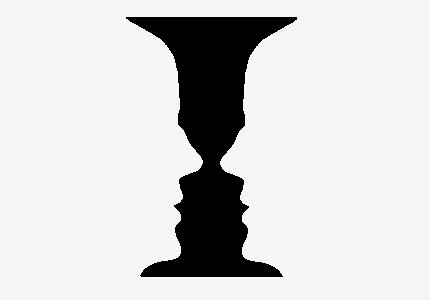
If you are new to the world of design, it often feels like there are no rules, and few words that can communicate why a design is working well or poorly. Human visual perception has been honed over hundreds and thousands of years to notice and interpret visual cues in our environment with great accuracy and prejudice. That translates as “I know it when I see it”, and can cause frustration and endless rework of a concept as a designer when often the solution can be as simple as moving something slightly or deemphasizing an element.
As interaction designers, we can be ignorant that many of these issues in nomenclature have been solved, or at very least named. The German Gestalt theorists came up with principles 100 years ago that are extremely valuable, especially in web and mobile design, since they tap into fundamentals of cognition that are true across all people. Gestalt principles of perception help to take the guesswork out of why a design succeeds or fails. By understanding and leveraging these techniques, you can discuss and leverage human perception, rather than fashion or flash.
The canvas in the real world
This principle is a bit ‘meta’ but gets at the first decision point before we start any design, the size and shape of the canvas. Lets take for example the real world. In 3D space with binocular vision, we have depth perception and our brains are wired to understand that space. When we encounter 2D spaces we automatically interpret them using the same rules, although they often don’t apply. Therefore this principle which refers to how in 2 dimensions we perceive an object in that space distinct from its background isn’t that useful. In pictorial 2D (or computer monitor) space, it is crucial. Think of a picture frame, the way we can contextualize something within a the frame as being the ‘ground’ which the subjects are contained within. We can move on to another picture and not have much trouble ‘re-entering’ the pictorial space. Deciphering which is figure and which is ground is easy if you take the screen itself to be the ground like our picture frame, the screen contextualizes it’s own array of layers. When designing, emulate some of the actual chrome of windows or any other elements that set up a relationship between your content and the operating system to get a realistic view of how your elements are perceived. If you want the true effect, set it up in a real environment and then contextualize the screen with the surroundings. Here’s a creative example of how to play with this concept.
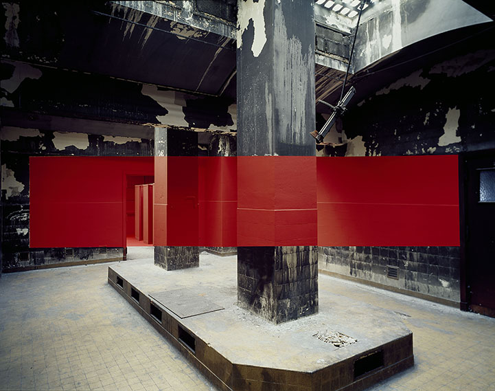
In real space you can only pull off figure/ground tricks with a forced perspective.

Let’s simplify. The background of the page is the ‘ground’ since it is regular and doesn’t contain any information other than color (white), the ‘figure’ is the dot. If the background contained information then there would be more cognitive work to do, so if we wish for clearer acquisition of our signal, putting it by itself on a high contrast background amplifies our connection. If the figure is simple enough, and with a good dose of symmetry, you should also be able to trigger a perceptual reversal, such as the circle representing a ‘hole’ in a white card or the famous ‘vase’ illusion leading this article. Playing with the perception of what is foreground and what is background is the basis for many optical illusions.
Figure/ground in interfaces
When placing imagery, we spoke about thinking about the monitor itself, most importantly it’s orientation and size. There are so many screens ranging from 65″ televisions to 2 inch cell phones. Smartphones have invigorated the portrait mode of viewing to fit into the hand. This new orientation challenged many accepted screen layout standards which were all optimized for landscape viewing. Many successful designs solved being the same on both orientations by literally cutting corners and displaying content within squares or circles, lessening issues of orientation. Designing across the two kinds of screens that need varying layouts to fill the space has made the ‘card’ one of the most persistent interaction design tropes.
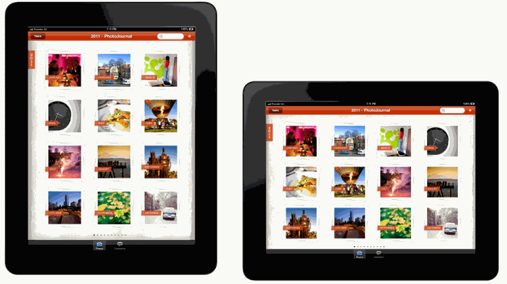
So to design effectively for figure/ground start with a realistic display of the layer hierarchy of a typical screen. Note how the design communicates which areas are content and isolate them from a neutral background. When you have several layers, consider deemphaizing or simplifying to emphasize the most important layer. 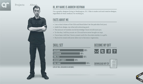
Good: A playful take on what is background, the neutral colors and subtle layers (note the ‘about’ link is covered up slightly) make this easy to enjoy.
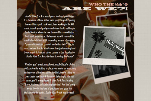
Bad: A background with a background – the neutral color plus the photograph cause visual confusion. Add to that text, which becomes lost in the noise ‘behind’ it making them read as almost the same layer, then adding the dimensionality of the ‘photographs’ seems to further confuse things because they are now the most prominent element, although they appear to just be decorative.
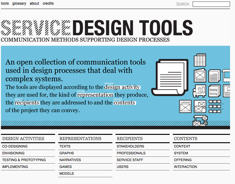
Meh: Most designs just seem to muddy things up, and leave the work to the viewer to figure out what is prominent, what is emphasized and what the layers communicate. In subsequent posts we’ll see how to use and misuse alignment, color, and other elements to create a clear picture.
Next post will tackle the Gestalt principles of proximity, share this if it’s helpful.
Thanks to the several videos and photographers and to Andy Rutledge’s article that helped me clarify my language.
