Designing data to drive decisions / Visualization framework for Accenture global
- Date: 2017
- Cient: Accenture
- Watch video
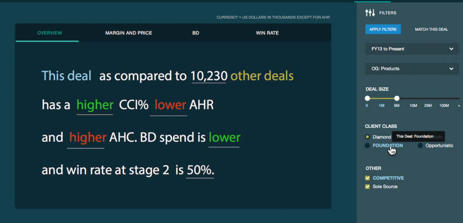
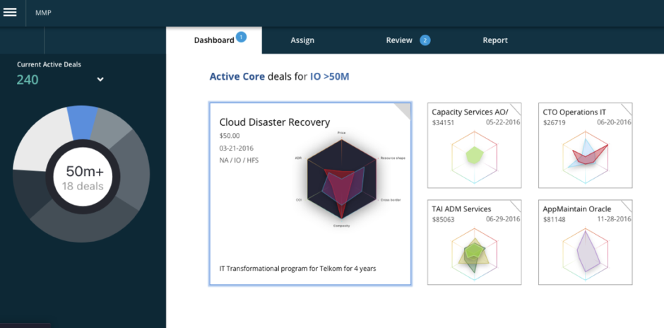
For Accenture, a S&P 100® company, the sales and revenue projections are the life blood of the company. The focus for leadership was primarily to reduce the need for custom reporting across the global client teams, and secondly to provide a consistent experience to aid in discussion and collaboration across different lines of business. My team of visual designers, researchers, UX designers and creative technologists were asked to provide design concepts and direction that would create a reusable, extensible platform across the enterprise.
Interviewing users provided insight that data was not always reliable. Experience and careful sorting and filtering were needed to determine actions. The existing reports and dashboards were often unreliable since data came in quarterly. Also, there was a sense of overload. Too much data that could often contradict each other and lead to false conclusions. Lastly, the decisions were hard to track, the systems didn’t offer feedback on how decisions turned into success. Our design needed to not just visualize, but to track these actions and see if they performed to expectations. It needed to use supporting information to help the user identify mistakes and outliers.
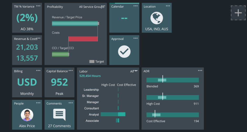
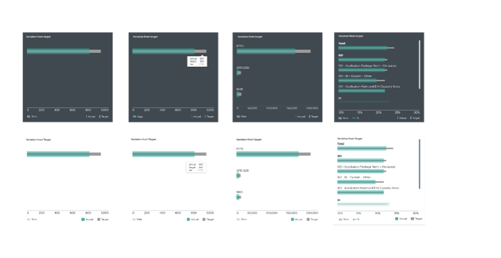
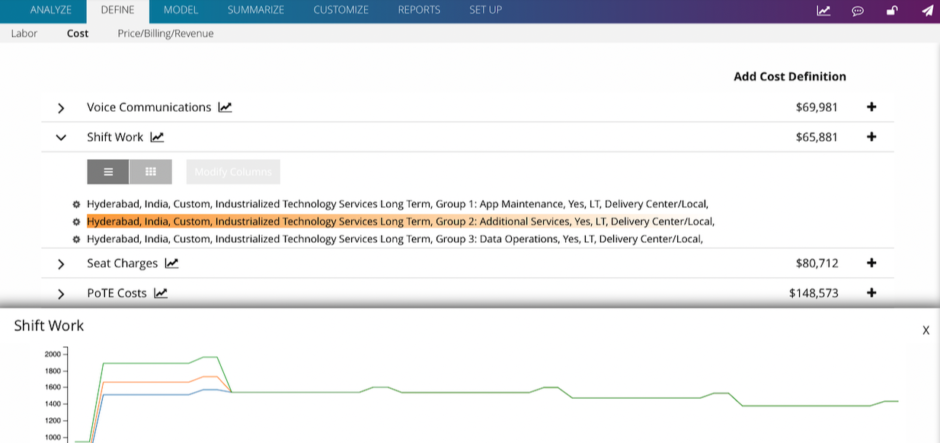
We created a concept with sample metrics, working to extend the Microsoft metro tile concept, due to our customer’s familiarity and use of Surface tablets. The metrics design enabled quick read, with easy access to details to support or contradict the intended triage. This design enabled quick parsing of a large variety of metrics. We prototyped in HTML using Angular, React and JSON to see if the solution was fast and scalable. This also allowed us quick feedback and user acceptance tests while the features were still being built. Our iterative process meant qroll-outl out of a product that was responsive to feedback from leadership who quickly engaged in this platform and process.
