Visualize your inventory / Abbott global iPad solution
- Date: Winter 2014
- Cient: Abbott Vascular
- Watch video
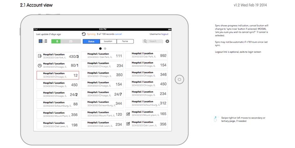
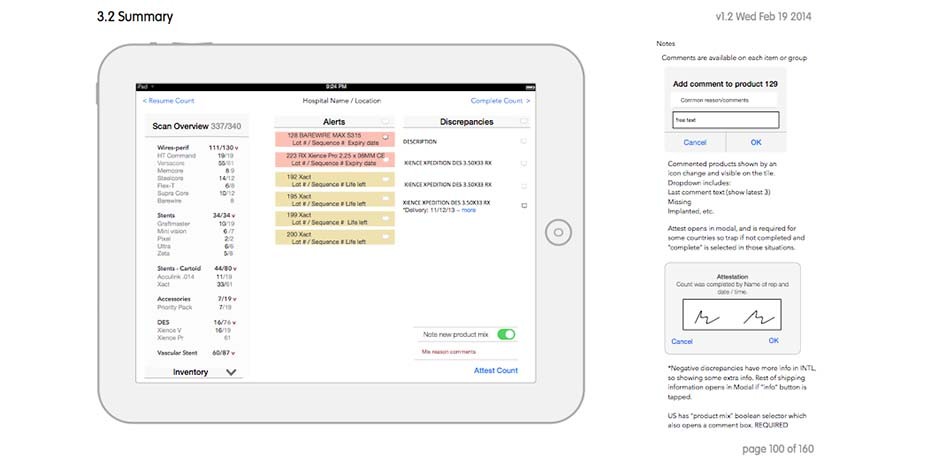
Abbott Vascular engaged Salesforce Services to reinvent their global inventory system using the power of the Salesforce cloud and CRM infrastructure. My role, as creative UX lead, was to envision how the expanded abilities of a tablet and touch could help reduce errors, help focus on the success of the sales and inventory process, and bill and track products more effectively.
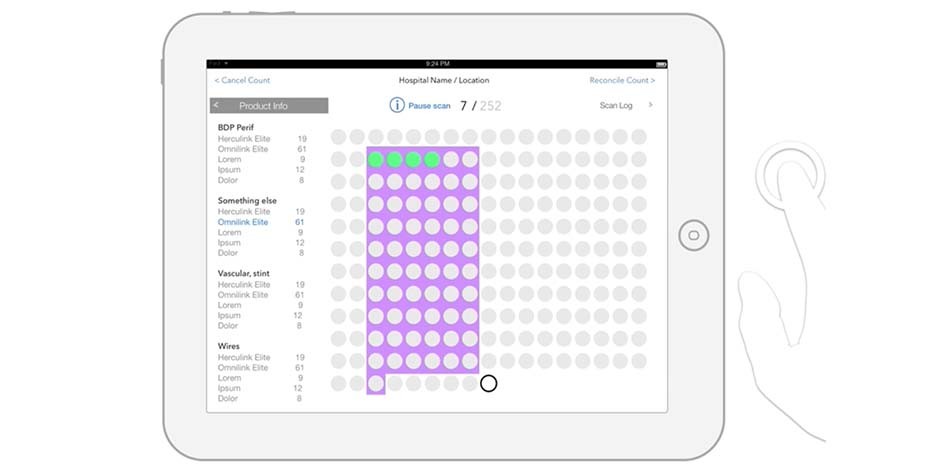
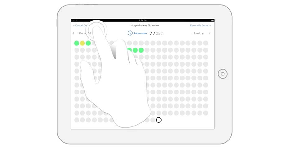
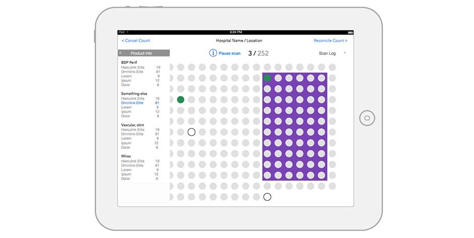
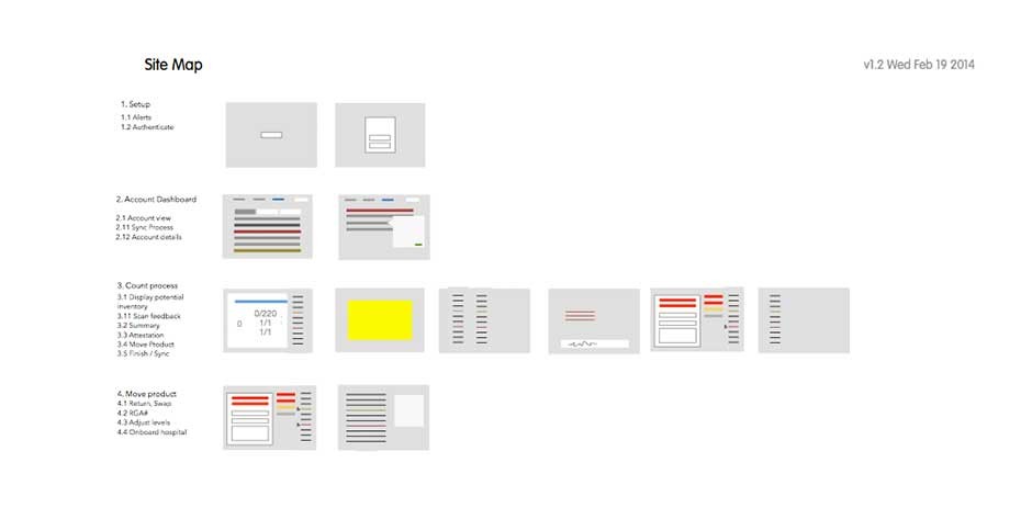
Working with the sales team we were able to identify and engage with real users, to determine the biggest priorities for the success of the system. Our sketches turned to storyboards, to prototypes in Keynote – to allow us to show the animations and transitions needed to help show an interface that was not really looked at. During the process, the user focuses on the product and the scanner, the interface showing too much detail was counterproductive, the minimal interface allowed viewing of success or issue with peripheral vision.
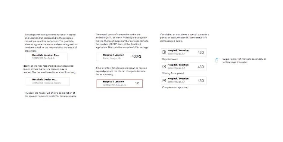
Succes was measured with the ability not only to find and report the product usage in hospitals but across a territory. We needed to account for different processes and technologies in Germany and Japan. Our design approach and platform needed to aid in territory management to show where the stock could be running low and allow for the education and replenishing process to evolve as technology evolved. The Salesforce platform and our custom interface allowed for more transparency and collaboration among support and sales staff.
